
As more television viewers flip to streaming services over traditional programming and spatial computing emerges as an exciting new frontier, product experts must be laser-focused on two business-critical outcomes: developing intuitive TV viewing apps and delivering seamless experiences.
AR, VR, and XR advancements may transform the media and entertainment sector. As new technologies emerge through products like Apple Vision Pro, we’ll continue exploring the limitless possibilities around the future of the TV-watching experience.
Although smart TV streaming services have existed since 2007, it’s nonetheless remained a challenge for media companies to transition from traditional linear TV to digital, multi-stream over-the-top (OTT) programming — or content delivered directly to consumers, bypassing conventional distribution methods like satellite or cable. Creating a cohesive and comprehensive design system that fits all TV platforms from scratch is also more challenging than it may seem.
Having launched successful OTT and media products for clients like HBO and Roku, WillowTree recently had the privilege of creating a TV app tailored to North American news viewers. The project demanded creative and innovative solutions as we sought to solve these industry challenges.
This article will spotlight three UX best practices we uncovered that designers and businesses need to incorporate as they build immersive TV streaming experiences: 1) ensure consistency across different streaming platforms; 2) enhance content discoverability; and 3) understand various scenarios and edge cases.
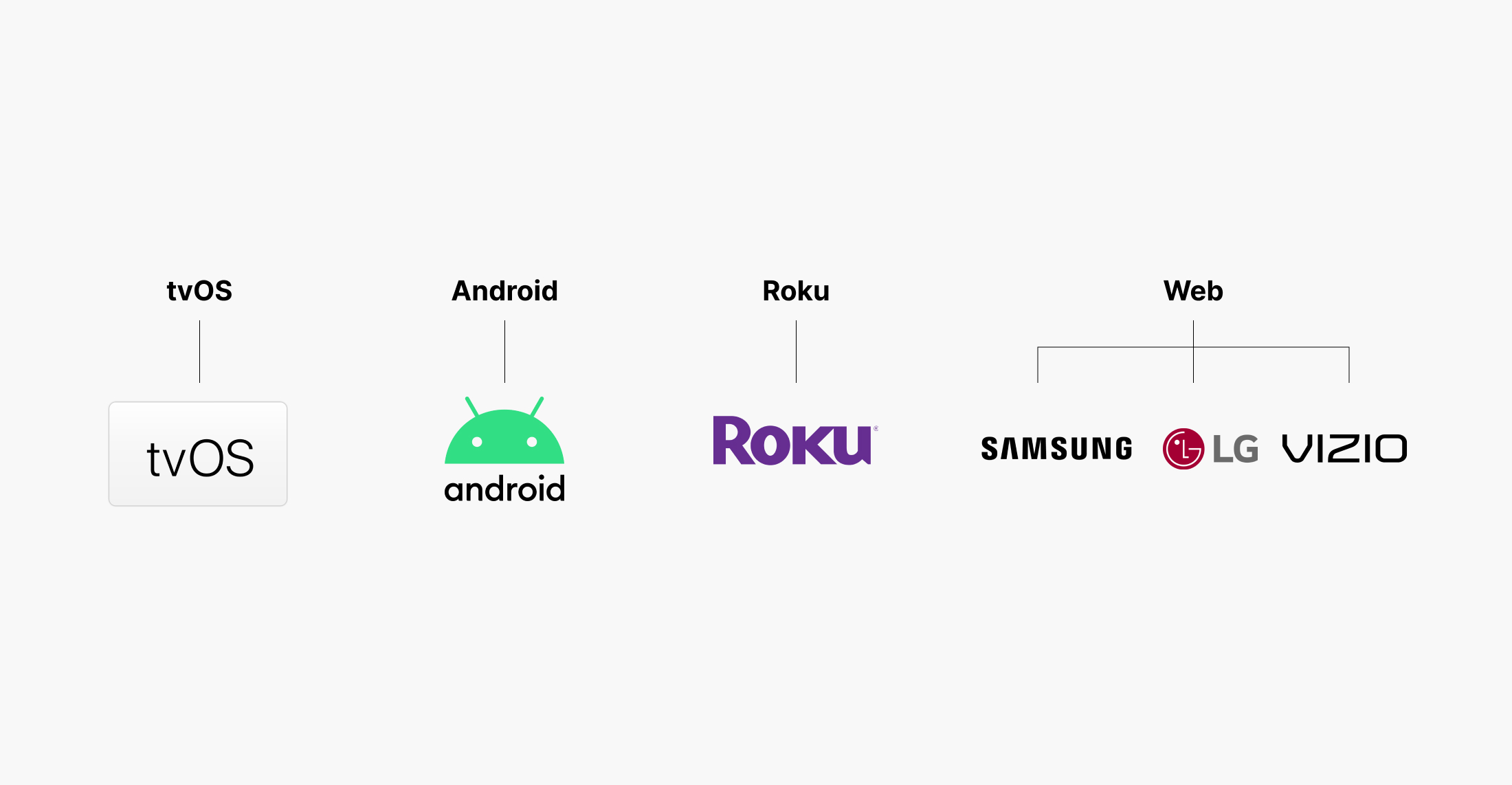
1. Ensure consistency across different platforms
User accessibility and cross-platform functionality must be top-of-mind for product teams building streaming experiences. However, maintaining a consistent user experience across different platforms — like tvOS, Android, Roku, and Web — can be challenging. Each has different design guidelines and constraints.
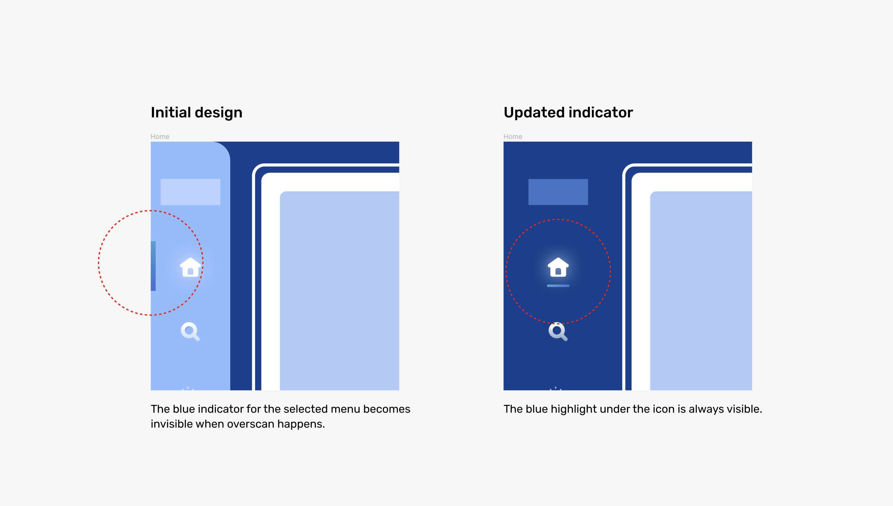
Take the “safe area” as an example. Each platform sets specific guidelines regarding safe areas to prevent “overscan” or the cropping of the visible image on the screen (common on older TVs). During the design process, we encountered that safe areas are platform-specific. This discovery led us to resize the sidebar navigation and other existing components. In essence, this design work ensured that viewers could see and interact with essential design elements in their entirety and on any TV platform.


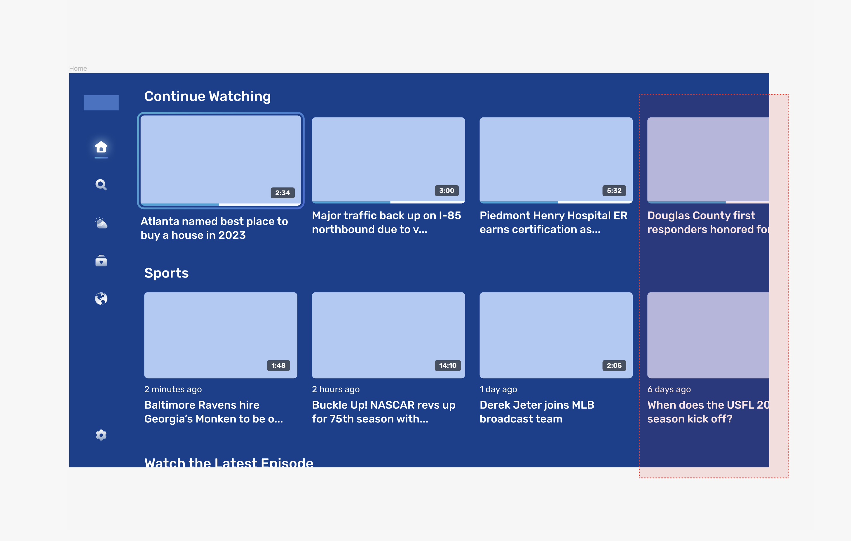
2. Enhance content discoverability
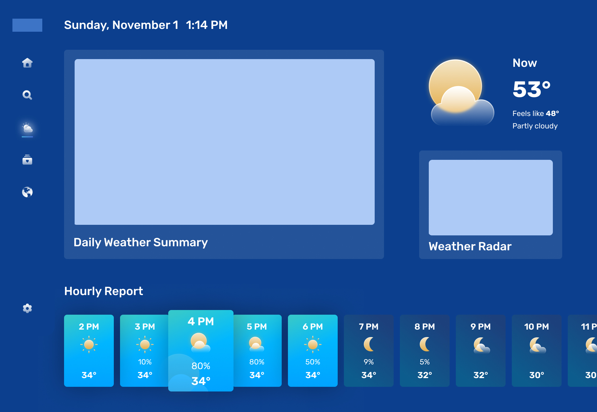
Ensuring that subsequent content is visible on the screen is crucial in informing users about the availability of additional content to explore. Given that users navigate this TV app exclusively using a remote control's four-way directional D-pad and enter key — which lacks flexibility compared to other devices with mouse or touch input — it’s essential to create a design that indicates selectable options and provides clear navigation cues.

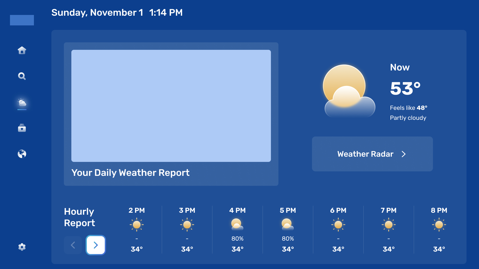
On this product’s “Weather” screen, the app offers a 24-hour forecast. Navigating through the hourly forecast is another aspect of content discoverability, and it’s critical to make it noticeable to users that they can scroll to view the forecast.
In the previous design, users could utilize arrow buttons to bulk-scroll the hourly forecast. However, the updated design suggests a different navigation approach, allowing users to hover over each time slot and use the remote control's intuitive right and left buttons. This way, the interaction patterns shift from the front-end (UI) to physical hardware (the remote). This shift reduces the cognitive load for the user and gives them a more natural way to interact with the content.
We made it easier and more intuitive for our users to interact with the content.
3. Understand various states of design components
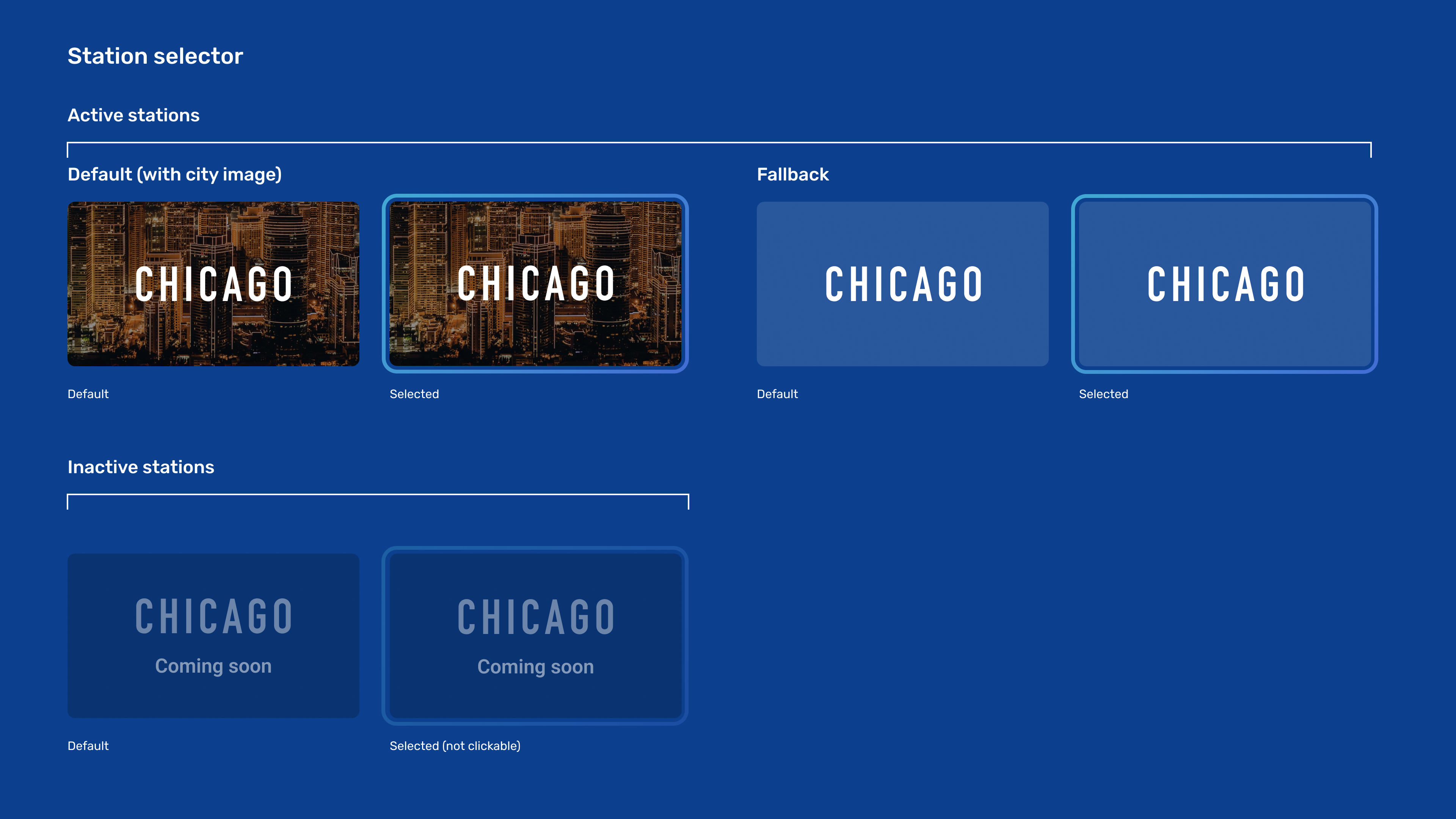
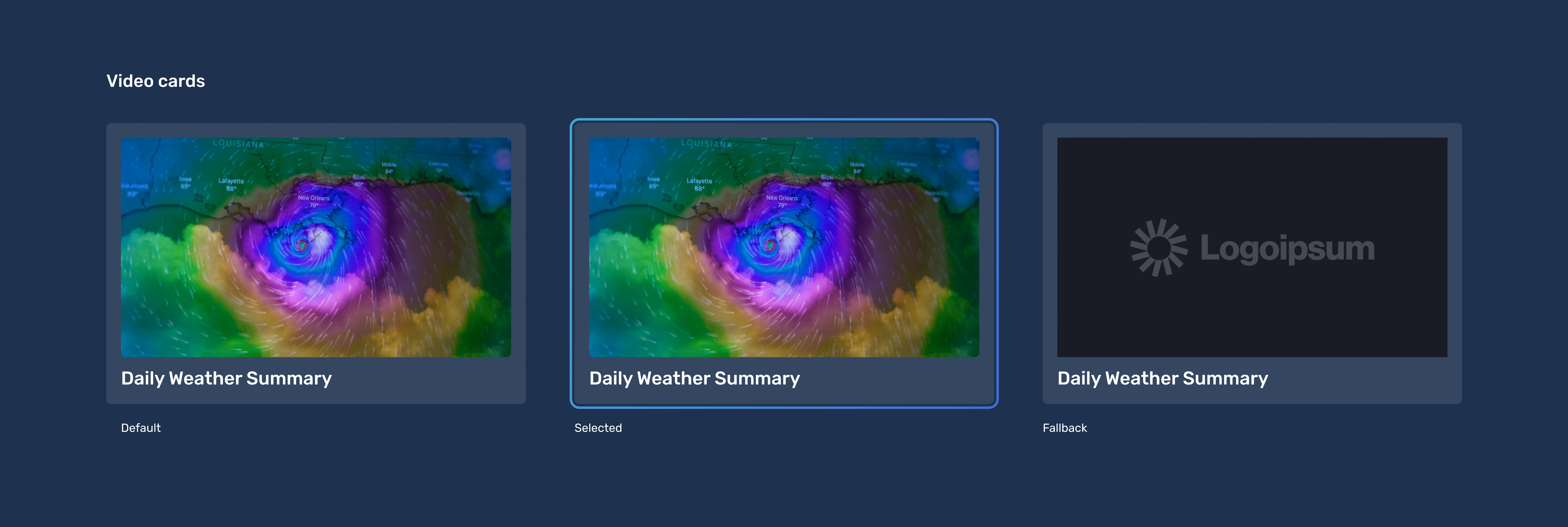
This is a crucial step in conceptualizing different states of design components — such as “default,” “hover,” “pressed,” or “disabled.” In addition to documenting these standard component states, we also had to account for additional considerations.
Error screens are a good example. We explored various scenarios in which users might encounter an error state. Through discussions and explorations, we identified four distinct error cases: no internet connection, unavailable or deleted video content, content unavailable due to geo-restriction, and a generic error screen for any other situation.

Understanding the edge cases is also critical in determining the design states we must develop. Because we built the app as a content management system that allows the client to add actual content like images, titles, copies, and more from the backend, we had to account for fallback states when images fail to load for various reasons. This accommodation allows alternate content to display when the intended image can’t be uploaded or rendered properly due to a slow internet connection, a broken URL, or unsupported image formatting.
Summary and final thoughts
Beyond the specific features mentioned in this article, creating a user-friendly TV app involves extensive effort and attention to detail. It requires designing for multiple platforms, maximizing content discoverability while working within the limitations of remote control navigation, and developing various states of design components. Post-MVP, our team’s continued innovation — and new feature availability in the marketplace — will support even more user scenarios and unlock even more valuable business opportunities.
