
We’re excited to have a pair of posts on accessibility standards this week: this post on designing for the blind, and another on designing for the visually impaired over on the InVision blog.
Technology available today has helped blind users accomplish tasks they weren’t able to before, approaching levels of independence and autonomy closer to their sighted counterparts. For example, a blind user I spoke to used to be unable to adjust the traditional round thermostat in her own home. Due to this, she would sit at home being too hot or too cold, waiting for her kids to come home and adjust it for her.
Then she got a smart thermostat compatible with the Amazon Echo, which lets her change the thermostat with the power of her voice. This level of independence can be achieved by blind users when we consider them in the design process.
We did an audit of the top 25 iPhone apps and found that 17/25 were accessible via VoiceOver, with most of those apps being from companies like Facebook or Google. Larger companies, of course, have more resources for helping to make apps accessible, but there are simple and low-cost ways that anyone can leverage to make their apps usable by blind people.
Blind users have very different needs from low-vision users when it comes to accessible apps. Details like contrast, typography, and colors don’t matter to blind users, because they will interact with your app by using a screen reading tool like Apple’s VoiceOver or Android’s TalkBack.
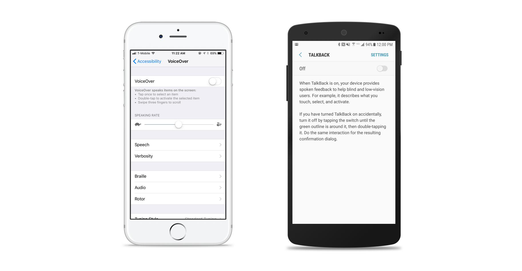
Screen reading tools
VoiceOver (iOS) and TalkBack (Android) come built into smartphones and allow blind users to hear and interact with the screen without being able to see it.
When designing your app, keep in mind that users should, at minimum, be able to perform the main task of your app using VoiceOver or TalkBack. For an app like Uber, the main task is being able to order a car to your location. Netflix’s main task is being able to navigate to content and hit Play.
Figure out your main task and make sure that you can accomplish it using only a screen reader. Apple’s VoiceOver is generally considered by blind users to be a better tool; however, Android’s TalkBack is always improving, so this may soon change.
Label buttons and loading states
Screen reading tools will read out loud the text on the screen, such as the body of an article. However, many other elements need to be accessible to screen reading tools as well, such as buttons and loading states.
Developers will sometimes add a button label during development if they remember to, but oftentimes they are just guessing what they think the label should be. You can help both developers and users by being sure to label each button the way you want it to be read by a screen reader. Apple has outlined a guide with best practices for using the correct language for labels and also has a detailed developer guide. Android has an accessibility guideline that includes details on how to label UI Elements.
A feature that most developers don’t take advantage of is accessibility and usage hints in iOS and Android. This feature allows the screen reader to read a different text than what is displayed on the screen to sighted users. For example, if you have a button labeled, “Add to Cart” you can have VoiceOver read “Add to Cart Button. Pushing this button will take you to the confirmation page before purchasing.” You can read about how to do this on iOS and on Android.
Many designers and developers know better than to leave buttons unlabeled— but something that often gets forgotten is loading states. Almost all apps have a loading state, some animated and some static. These screens serve as a placeholder before users can see or interact with the content; however, in the absence of a label, blind users only perceive that nothing is happening on the screen, which could mean that the app has crashed, is unusable with a screen reader, or is loading.
The simple fix for this is to label your loading states to let the user know that the app is loading and content will be available soon.
Both Netflix and Reddit’s apps both have loading states, but Netflix has labeled theirs, while Reddit has left theirs unlabeled. Unlabeled buttons are confusing to blind users and give them no input into what is happening on the screen.
Clear exits for modals
Almost every app you download will have a pop-up modal at some point, especially during onboarding (like when asking for permission to send push notifications). Both Apple and Android have their own guidelines for modals and dialogs that you can read up on.
Apple’s Human Interface Guideline says: “Provide an obvious and safe way to exit a modal task. Make sure people always know the outcome of their action when they dismiss a modal view.”
Android’s Component Guide says: “Dialogs may be dismissed either by tapping outside of the dialog, or tapping the system back button (on Android).”
Oftentimes, however, when designers make their own modals, they do not include a clear exit path and instead rely on the users to click outside of the modal to exit. This is not as important on Android devices, where users can simply hit the system back button. But on iOS devices, it is important to provide a clear button to exit the modal.

Use descriptive language
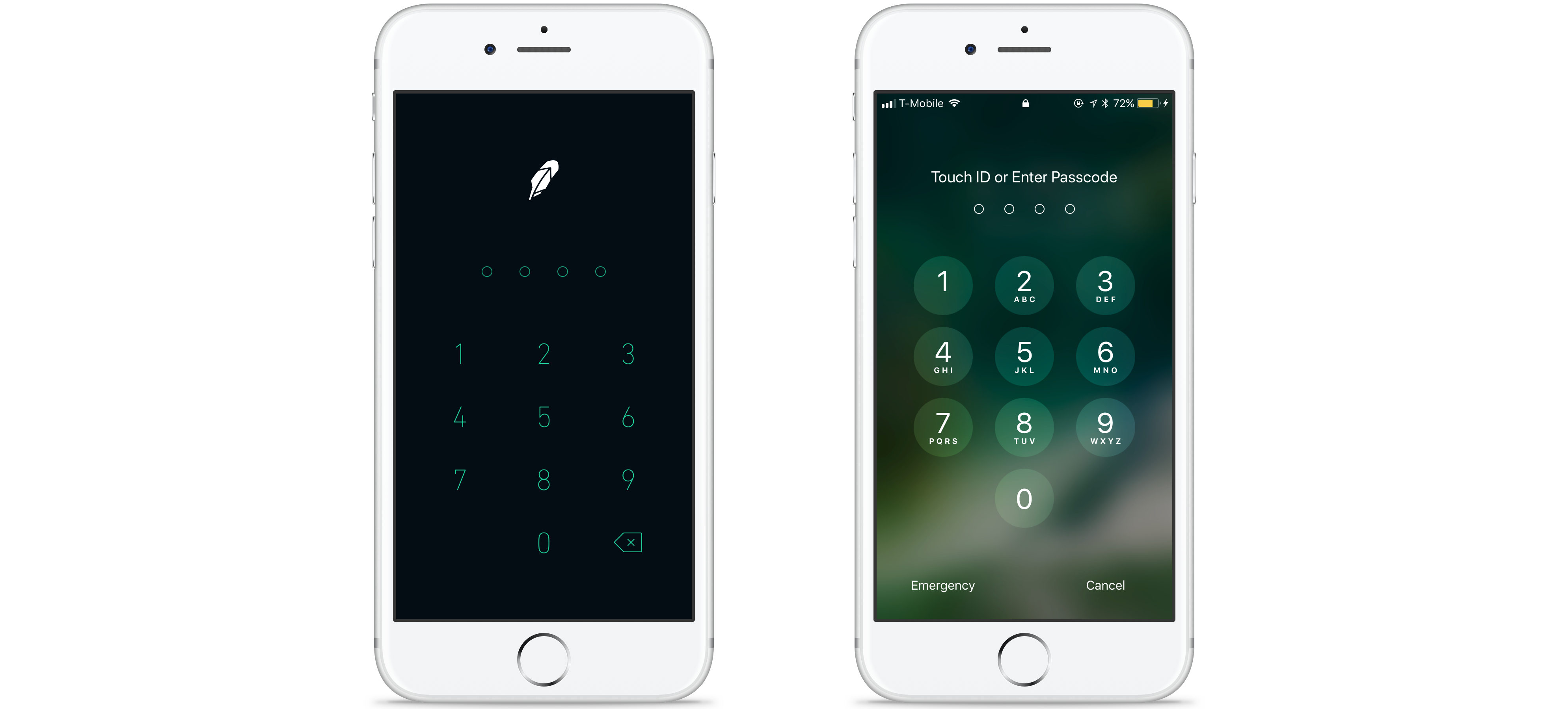
Keeping in mind that blind users take in all their information about a screen through screen readers, consider how to convey information to users who are unable to see the screen. An example of a common problem with this in many apps is use of the passcode screen for security purposes.
For example, Robinhood requires the user to enter a passcode when entering the app—but there is no way for blind users to know what the app wants them to do. They can only move around on the screen using a screen reader, realize they are on a numeric screen, and then perhaps guess that they need to enter a passcode.
A better example is the iOS lock screen. It includes simple text at the top that says, “Touch ID or Enter Passcode.” This simple text lets blind users know what you expect them to do.
Deliberate hierarchy
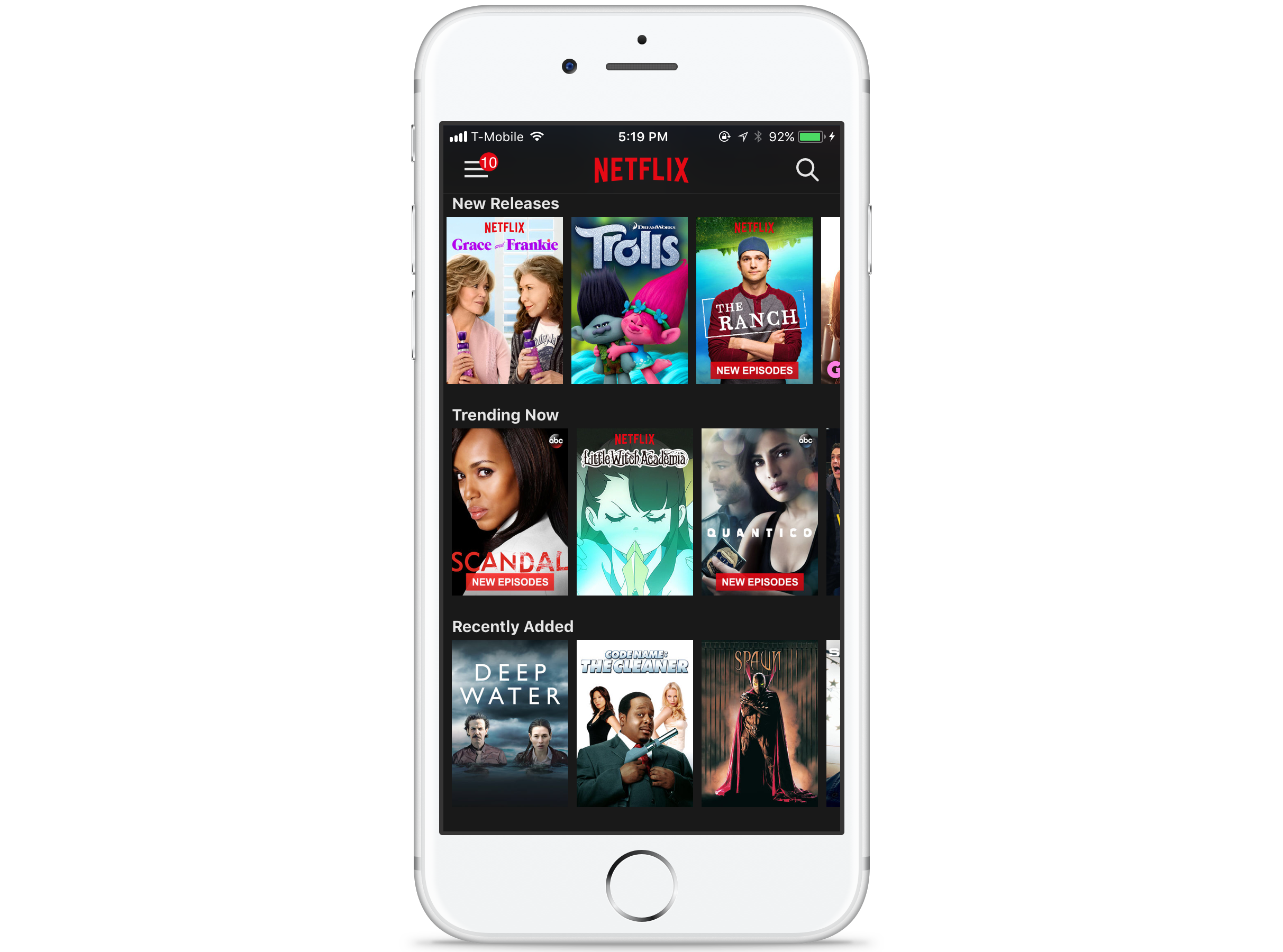
When you land on a webpage or an app page, you don’t start reading it from left to right and read every single word on the page. You most likely gravitate to the most important content, such as the title of an article or the task you are trying to accomplish. In the same way that our eyes guide us to the most important content, screen readers should allow blind users to find the most important content on the page.
A way to designate hierarchy is by using headings (currently only available in iOS). Headings should be used on pages with lots of content broken into categories because they allow users to navigate through pages quickly by skipping from heading to heading.
One app that does a great job with headings is Netflix. Because Netflix offers hundreds of shows and movies,navigating through the home page would be extremely time-consuming for blind users using screen readers, as they would not know know which shelf they are currently in. Since Netflix has designated headings for shelves, users can easily skip from shelf to shelf to get to the content they want. The headings on the screen below are “New Releases,” “Trending Now,” and “Recently Added.”
Add alt-text for images
Almost all content nowadays has some kind of visual or image to go along with it, but not all images are labeled. When images are not labeled or given a caption, blind users hear only the word “Image,” which provides no value to them. This concept applies to both web and mobile and if you’re content is available on both platforms you should use the same alt-text for both.
Facebook is doing a great job of using artificial intelligence to describe images to blind users. But if you, like most of us, don’t have this capability, then you can simply add a description to your images or designate alt-text for all images. Twitter, for example, allows you to add descriptions to your images in an effort to make the platform more accessible to all users.
Use sound to communicate messaging
We talked earlier about not using color to communicate messaging to low-vision users. However, sound is something that you can use to communicate messaging to blind users. For example, when users go from one nav item to the next, there should be a sound to let them know that something on the screen has changed and what they just tapped on worked. In the same way, if the user enters an incorrect password or if an error occurs, there should be a distinct sound to let the user know that something is wrong.
A lot of these sounds come built into the iOS and Android so be sure to work with your developers to decide how you want these alert sounds to work in your app.
Empathy is key
Both low-vision and blind users have very different needs, and you should consider both groups when designing app experiences. In terms of low-vision user needs, many apps are starting to add things like dynamic text and dark modes, but we still have a long way to go to make sure that they are usable by low-vision users.
When it comes to blind users, more and more apps every day are accessible to them, but a majority of them remain inaccessible. All of the changes you can make for blind users are a relatively easy to implement, but will make a huge impact on the blind community.
On a digital product team it is everyone’s responsibility to have empathy for users and thus all users, no matter their ability, should be considered in the design process.
